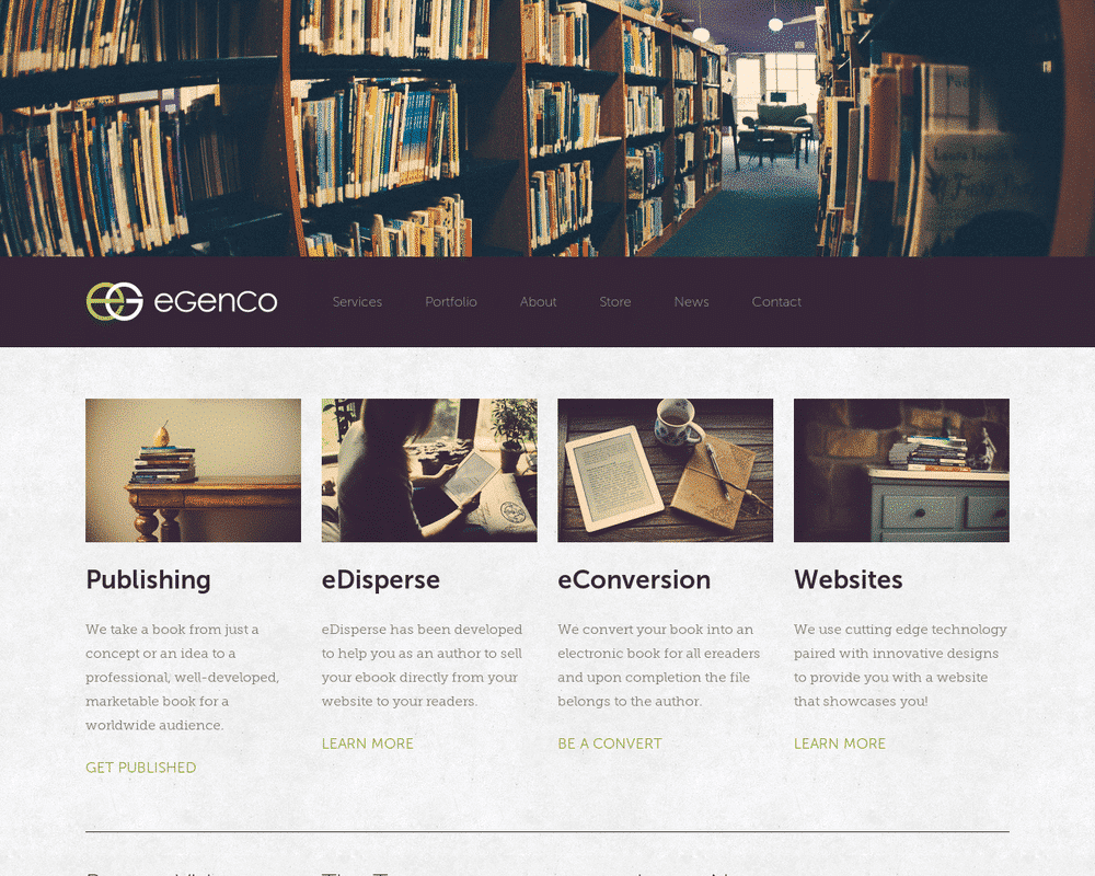
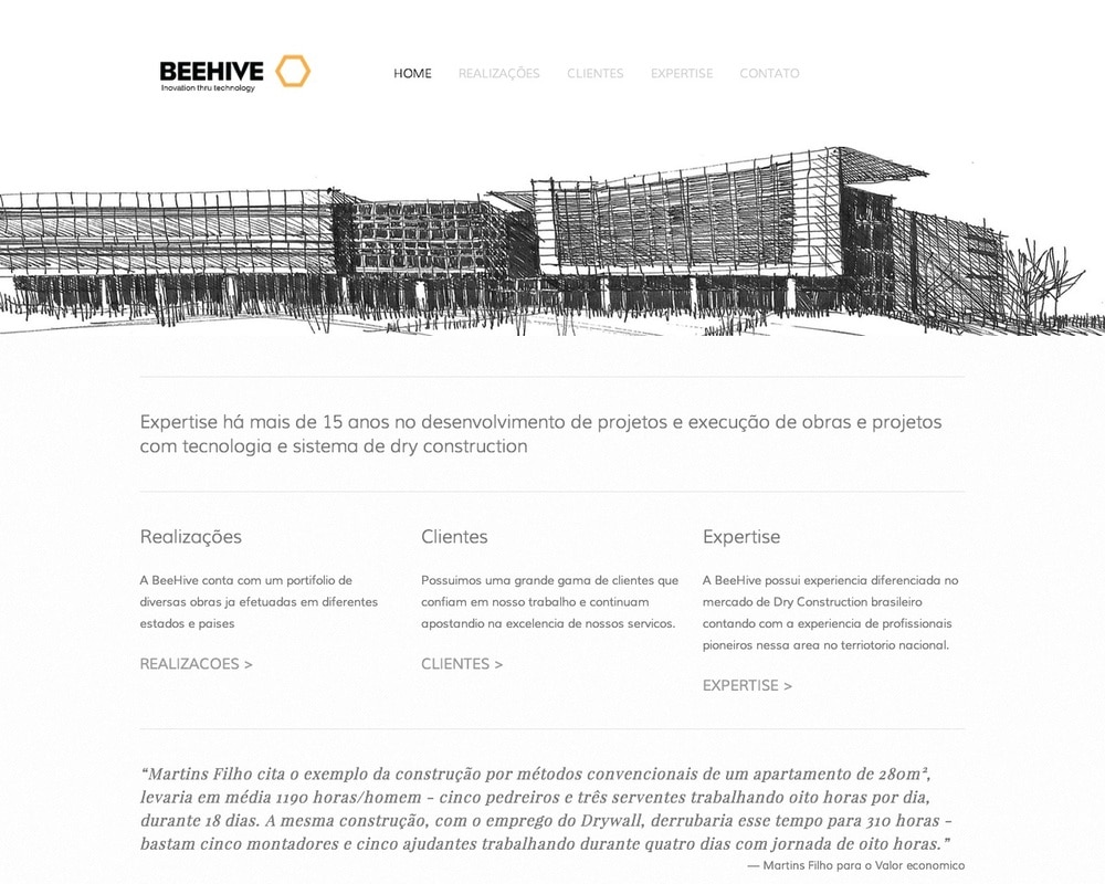
Five is a super-flexible template designed to provide you with many customizable settings allowing you the freedom to create lots of different styles & looks for your website layout.
Site Wide
Site Background – choose a color that will fill the site background.
Site Background Image – upload your own background image to be used as the site background.
Site Width – control the width of the content area for the site, including any sidebar width.
Canvas Setting – controls whether the site canvas stretches out to the edges of the browser window (full) or snaps to the site width instead.
Canvas Offset – determines the margin above and below the canvas, exposing the site background.
Canvas Padding – adjust the padding main content area and the sidebars – if present. Also controls the space between the logo and navigation when together.
Canvas Border Size – sets the size of the border wrapping around the outside of the canvas.
Lines & Decorations – control the color of miscellaneous lines and decorations throughout the template.
Hide Delimiter – turns off the ‘/’ delimiter between navigation links and meta data bits.
Header
Header Background – choose a color for the background of the header area.
Header Background Image – set a default image to the background of the header area.
Site Title Color – choose a color to be assigned to the site title within the header.
Site Title Hover Color – choose a color that will be used upon hovering the site title.
Page Title – set the typeface, style, size, line height, transform and letter spacing properties of the page title.
Page Title Color – choose a color to be assigned to the page title within the header.
Page Title Hover Color – choose a color that will be used upon hovering the page title.
Site Tagline – set the typeface, style, size, line height, transform and letter spacing properties of the site tagline.
Site Tagline Color – choose a color to be assigned to the tagline within the header.
Banner Area Height – set the height of the banner area at the top of the canvas.
Banner Content – determines the content that is shown within the banner area.
Logo Height (Banner) – limits the height of the site logo when present within the banner area.
Page Thumbnail as Banner – enables a page thumbnail to be used in the header area.
Stretch Page Thumbnail – stretches the page thumbnail out to the edge of the window when enabled.
Navigation
Navigation Background – choose a color for the background of the main navigation area.
Site Name – set the typeface, size, transform and letter spacing properties of the site name in the navigation area.
Navigation – set the typeface, style, size, transform and letter spacing properties of the navigation text.
Navigation Link Color – choose a color to be assigned to the navigation links.
Navigation Link Hover Color – choose a color that will be used upon hovering the navigation links.
Navigation Active Link Color – choose a color that will be used on active links in the navigation.
Navigation Spacing – controls the amount of padding used on the top and bottom of the navigation area.
Logo Height (Navigation) – limits the height of the site logo when present within the navigation area.
Top Navigation Position – positions the main navigation above or below the site banner area. If set to ‘None,’ the navigation will be shown in sidebar 1 as a simple vertical list.
Top Navigation Alignment – controls the text alignment of the navigation links.
Disable Navigation Border – removes the border from the bottom of the navigation area.
Main Content
Canvas Background – choose a color for the background of the canvas (page body) area.
Canvas Background Image – upload your own background image to be used as the canvas background.
Heading 1 – set the typeface, style, size, line height, transform and letter spacing properties of H1.
Heading 1 Color – choose a color to be assigned to H1.
Heading 2 – set the typeface, style, size, line height, transform and letter spacing properties of H2.
Heading 2 Color – choose a color to be assigned to H2.
Heading 3 – set the typeface, style, size, line height, transform and letter spacing properties of H3.
Heading 3 Color – choose a color to be assigned to H3.
Body Text – set the typeface, style, size, line height and letter spacing properties of all body text.
Body Text Color – choose a color to be assigned to all body text.
Body Link Color – choose a color to be assigned to text links.
Body Link Hover Color – choose a color to be shown when text links are hovered with a mouse.
Blockquote – set the typeface, style, size, line height and letter spacing properties of blockquotes.
Page Spacing – controls the amount of spacing used at the top and bottom of pages.
Sidebar
Sidebar 1 Width – set the width of sidebar one (when present).
Sidebar 2 Width – set the width of sidebar two (when present).
Sidebar Text Size – a size relative to the body text, of the text used inside either of the two sidebars.
Sidebar Position – sets the display location of the sidebar(s) across all pages.
Site Description in Sidebar – reveals the site description text and site title in sidebar 1.
Underline Sidebar H3 – adds an underline to any H3 element present in either sidebar.
Footer
Footer Text – set the typeface, style, size, line height and letter spacing properties of text inside the footer area.
Footer Alignment – controls the text alignment of the footer text.
Disable Footer Border – removes the border from the top of the footer area.
Social Icons
Social Icon Size – set the size of the template specific social icons.
Social Icon Color – choose a color for the template specific social icon links.
Social Icon Style – sets the template specific social icons style.
Social Icon Placement – sets the template specific social icon position.
Blog
Meta Text – set the typeface, style, size, line height and letter spacing properties of blog meta text.
Meta Text Color – choose a color that should be used on blog meta text.
Article Spacing – adjust the space between posts on the blog list view.
Blog List Display – choose the type of information shown on the blog list view.
Blog Byline – determine the position of the articles author name when showing a blog post.
Blog Dateline – determine the position of the articles date on a blog post.
Disable Pagination Border – enables a border on the top and bottom of blog pagination.
Hide Excerpt Thumbnail – will hide the excerpt thumbnail on blog list page.
Hide Icons – will hide all the small icons used in blog meta information.
Hide Tags Categories – will hide the tags and categories from view in a blog.
Gallery Styles
Gallery Navigation – determines the type of gallery image navigation is provided on the page.
Gallery Info Overlay – select the type of display used for image title and caption.
Gallery Aspect Ratio – controls the aspect ratio (width:height) for the gallery active slide.
Gallery Arrow Style – determines the style of the arrows used to cycle through the slides.
Gallery Transitions – select the transition styles used to animate between slides being viewed.
Gallery Show Arrows – choose to use arrows for cycling through slides.
Gallery Auto Crop – choose to auto crop slide images to the selected ratio.
Gallery Autoplay – choose to cycle gallery images automatically without user interaction.
Gallery Loop – enable a gallery to cycle through to the first slide after the last slide.
Gallery Autoplay Speed – specify the speed at which the gallery pauses on the active slide.
Gallery Thumbnail Size – control the height of thumbnail images when used for gallery navigation.
Gallery Arrow Background – specify the color that is used for the shape of gallery arrows.
Gallery Arrow Color – specify the color that is used for the arrow itself.
Gallery Circle Color – specify the color that is used for the circle shape gallery arrows.
Gallery Info Background – specify the color used in the background of the image title and caption.
Product Styles
Product Background Color – sets the color behind the product image.
Product Overlay Color – sets the color of the overlay when product list titles are set to ‘overlay.’
Products Per Row – determines the number of products shown per line on the product list.
Product List Titles – controls the position of the product title on the product list.
Product List Alignment – sets the text alignment of the product title on the product list.
Product Item Size – select an image ratio for the product photo on the product list.
Product Image Auto Crop – determines whether product images fill the image area or fit within.
Product Gallery Size – select an image ratio for the product gallery on the product item page.
Product Gallery Auto Crop – determines whether product images fill the gallery area or fit within.
Show Product Price – shows the price on the product list page when enabled.
Show Product Item Nav – shows the ‘back to shop’ link on the product item page.
Event Styles
Event Time Format – toggle between 24 hour or AM/PM for event times.
Event Icons – enable icons on the address and event time display.
Event Thumbnails – show an image thumbnail in list view.
Event Thumbnail Size – controls the size (ratio width:height) of the event thumbnail image.
Event Date Label – enable date overlay on top of event thumbnail.
Event Date Label Time – include the time of the event with the date overlay.
Event Excerpts – show optional excerpt text of events on the list view when present.
Event List Date – show the full event date (day, month, year) of the event on the list view.
Event List Time – show the time range (start time-end time) of the event on the list view.
Event List Address – show the event location address when present.
Event iCal/gCal Links – show links to add events to Apple or Google calendars.
Event Like and Share Buttons – show Squarespace simple like and share buttons on events.
Event List Compact View – enable a simple stacked view of events in the list view.
Event Calendar Compact View – enable a simpler calendar view optimized for smaller areas.
In Depth Guide
Our Customer Care team has created a very useful guide on Using the Five Template if you’d like a more in-depth look.
Banner image by Rotellini Luciano


